Back to Blog Home
21 unique accounting firm website examples to check out

Your website is your first impression. You can’t afford to mess it up.
When business owners are looking for an accounting firm to help them manage their finances, their first interaction with a potential firm is through their website.
Whether they’re considering a large accounting firm or looking for an individual bookkeeper, a professional accounting firm website is often the best source of information about a firm's work and expertise. This makes it one of your most important tools for attracting new business.
How do I create an accounting firm website?
There are several different approaches to this question.
It's possible to make a reasonably smart website using simple site-building platforms like Webflow, Wix, or Squarespace. Each of these platforms takes a no-code approach to site creation, letting users generate simple sites that are functional, without having to be expert web developers.
Other firms use a basic client portal to allow existing customers to access secure document storage and other functions, but don’t have a full public site.
We believe a better approach is to invest in a proper site, with regularly updating content that includes SEO keywords, which push your page to the top of SEO listings, help you attract clients, and act as a perfect landing page for any ads you place on social media or ad servers.
With this website, you can also integrate a client portal — giving your clients access to their own personal dashboard within your accounting firm website.
Both approaches allow you to create a slick, high-performing site with advanced business tools built in. Such tools might include support for invoicing and billing, secure document sharing, e-signatures, facilities for tax filing, form builders, document templates, workflow automations, and more.
In this article, we’ve put together a few pointers on what to include on your accounting firm website and have found 21 good practice examples to share. Let’s get into it.
What makes a good accounting website?
Here are some of the main features of successful, high-performing accountancy sites:
The essentials:
- Professional, simple, attractive design with lots of space to balance the text blocks.
- Easy to locate contact or query forms.
- Biographies and photographs of key personnel.
- Descriptions of the services offered.
- Clarification of the type of client serviced (solo entrepreneurs, small business, corporate).
- An easy-to-navigate menu, with a handful of headers.
The desirables:
- Thought leadership articles, either in blog posts or embedded video content.
- A secure client portal for document sharing or invoice payment.
- Moving design elements, such as images or testimonial carousels.
- Client case studies or testimonials.
- Social media links.
- News stories featuring your firm or the industry at large.
- Downloadable free toolkits, forms, or eBooks.
- A mission statement or corporate ethos.
- Accessibility features, for visually impaired visitors.
21 examples of accounting firm websites to learn from
Below we’ve picked 21 of the best accountancy firm sites, many of which showcase the features outlined above. We hope they’ll inspire you!
1. Sophia Hoffman
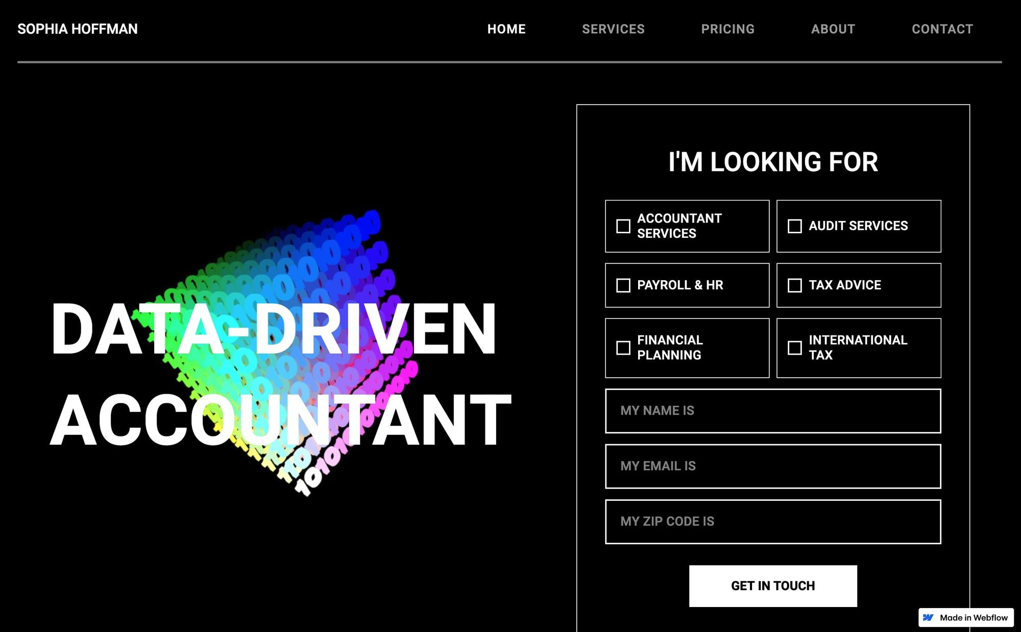
- Website built with: Webflow
Hoffman sets out their stall admirably, with smart black-and-white styling and a clever interactive graphic that moves along with your cursor. They state upfront their approach — a “data-driven accountant” — and the landing page includes a contact form, which filters queries according to what clients are looking for.
Each individual service is broken down, with brightly colored pages that contrast with the black and white landing page. Hoffman’s about page begins with a quirky biography, a friendly photograph, and some informative blog articles. Crucially, there’s a newsletter sign-up form for lead capture, and the contact link never leaves the screen.
2. Grant Thornton
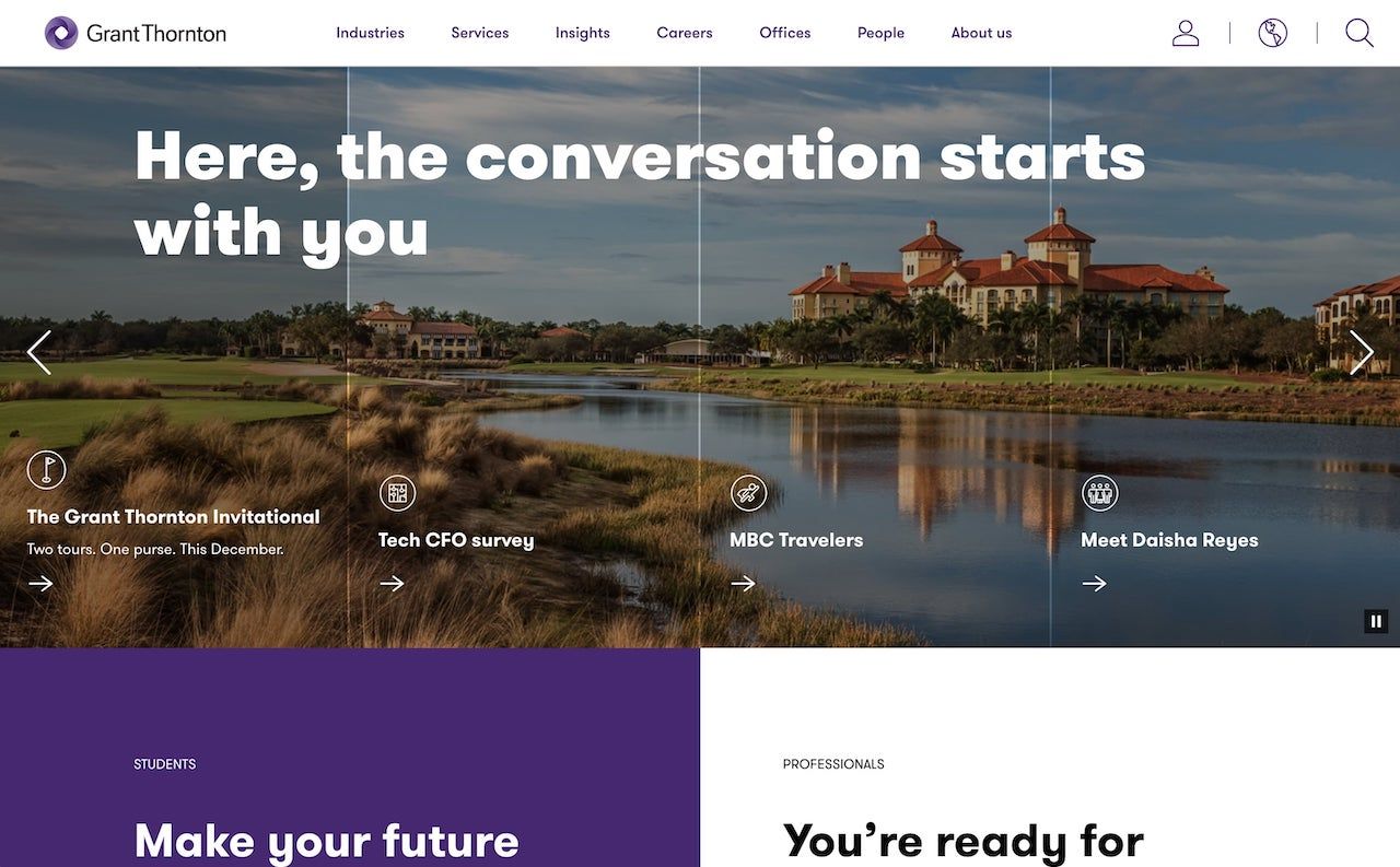
- Website built with: Adobe Experience Manager
This attractive website incorporates movement and photography to catch the eye, with a moving carousel of thought leadership articles, reinforcing Grant Thornton’s expertise. Furthering this, the company runs a series of seminars and webcasts, covering all the industries their clients work within.
There’s a lot of information on this site, but the visitor doesn’t get lost because the simple menu strip breaks it down into well-defined areas such as “services”, “industries” and “people.” There are easy-to-find contact and careers forms, plus a “submit your RFP” link to accelerate lead capture.
The site’s smart and thorough design positions it as a heavyweight corporate entity with a friendly face.
3. LongTerm CPA
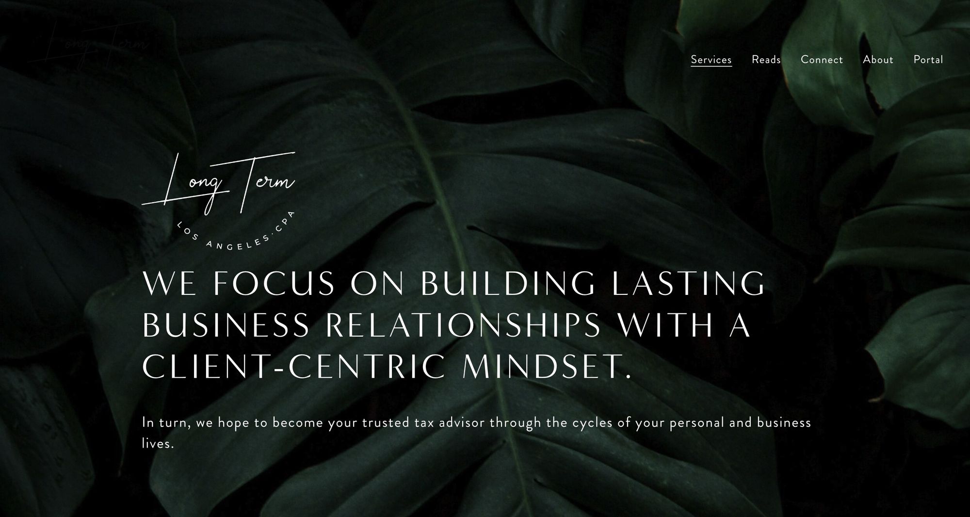
- Website built with: Squarespace
At first sight, Long Term’s landing page could be mistaken for a sustainable cosmetics brand, with calming, elegant fonts, and leafy background. What the design emphasizes, subtly, is how partnering with Long Term will promote peace of mind and relief (or at the very least, tax relief!).
The site utilizes simplicity and white space, and the main menu is easy to navigate with blog articles themed by industry under “read.” There’s a breakdown of services and a pleasant biography of CPA Kenneth although a minor quibble might be that he doesn’t give his surname, making it difficult to check his registration details.
That said, the site is elegant and easy to use, with a basic contact form and a secure client upload portal.
4. Baker Tilly

- Website built with: Custom React code
The eye-grabbing power of movement and color is utilized in Baker Tilly’s impressive site. The photography and animations stand out, making visitors want to explore. Thought leadership is the big sell here, with numerous articles featured at the top of the landing page, almost as if we’re visiting a news source.
The main menu is accessed via the triple-line icon at the top left of the page, allowing more space for the impressive visuals. Nevertheless, there’s a lot of content, including a breakdown of industries, services, news, and events the firm runs, and a filtered contact form.
The site emphasizes expertise and experience, with a little less focus on individual accountants, as befits a large corporate site.
5. Quincy Janell CPA
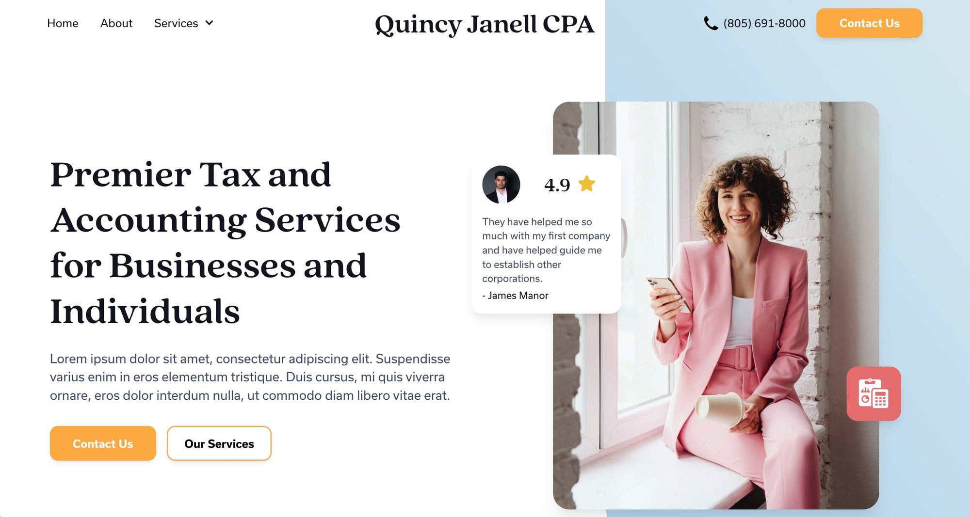
- Website built with: Webflow
This site balances white space and easy navigation with an attractive photo of Janell and, all too overlooked on professional sites, a client testimonial. There are more of these further down the landing page, as well as a query form, and a simple service breakdown.
When we looked at the site, it was in the process of being revamped, so not all the links were ready. However, what is evident is that the approach will be clean, straightforward, and personable (Janell includes a phone number, something too frequently hidden on more corporate sites).
6. Mazers

- Website built with: Custom code
Mazars combines an easily navigable menu strip on the top of the landing page with a carousel of beautiful images, each of which highlights an article revealing industry expertise. Topics covered include cyber security and sustainability, positioning the brand as a go-to firm for large corporate clients.
Their “about us” section is unusually thorough, including a brand statement, a piece on diversity and inclusion, and news articles. Social media links are included, another aspect sometimes overlooked by accountants. Their contact form contains as few fields as possible to maximize completion, while including plenty of space for complex queries.
At the bottom of the landing page, an extended menu lists everything that’s on offer, for visitors who prefer to jump straight to what they need. Overall, this is a slick site, as befits a leading global brand.
7. Janet Morhart
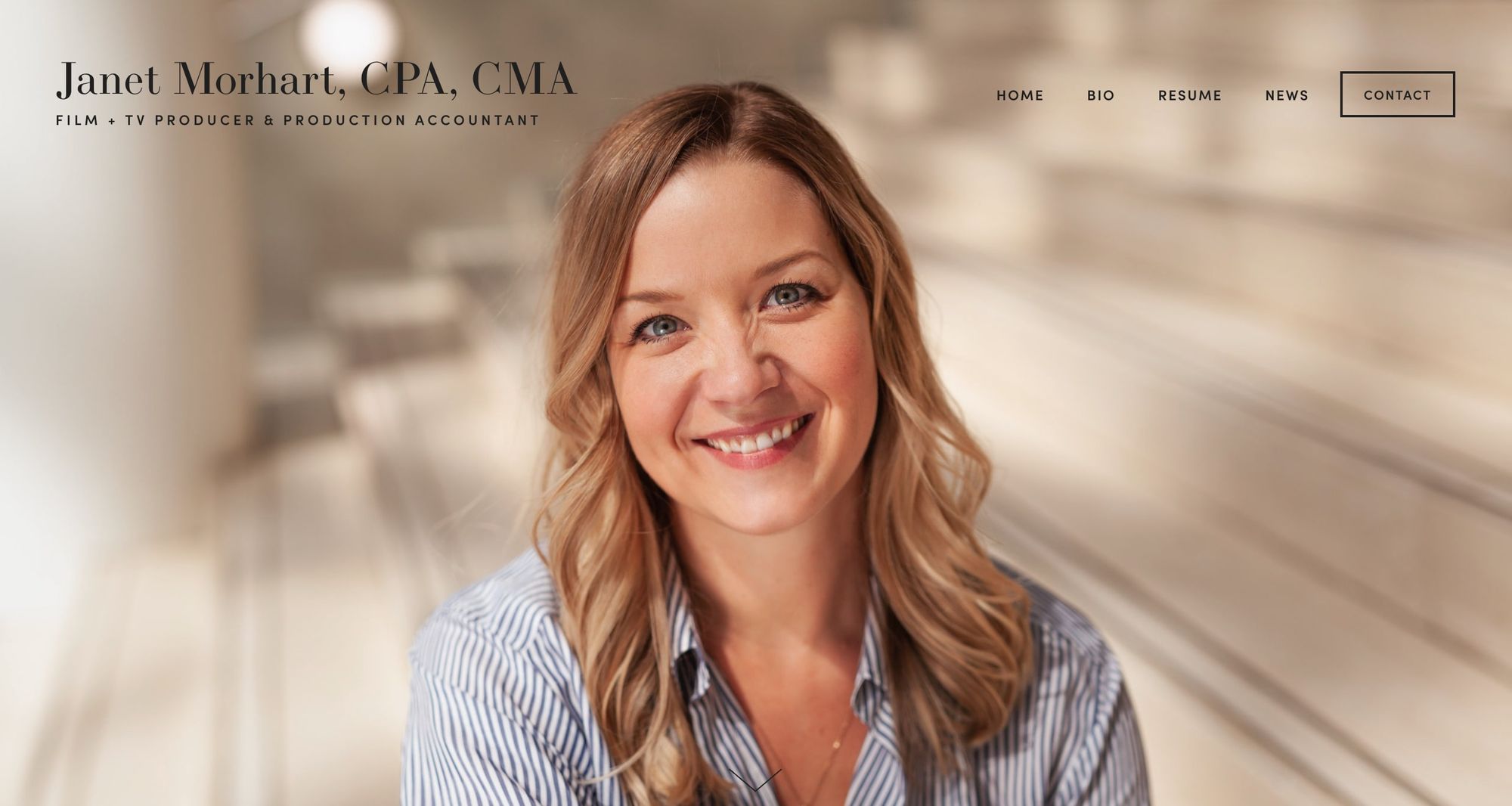
- Website built with: Squarespace
Fittingly for TV producer and production accountant Janet Morhart, her site leads with a captivating image of the photogenic professional. It’s an object lesson in not neglecting those professional photoshoots.
The site almost has the feel of an influencer social media feed, with news stories focusing on Morhart’s achievements, although this section needs updating since the last posting is from October 2020. Unusually, she includes her resume as well as an expanded biography.
With her own production company to run, it’s understandable that Morhart doesn’t focus on her range of past clients. However, there’s also a refreshingly simple contact form for inquiries.
8. Pearl Chartered Accountants
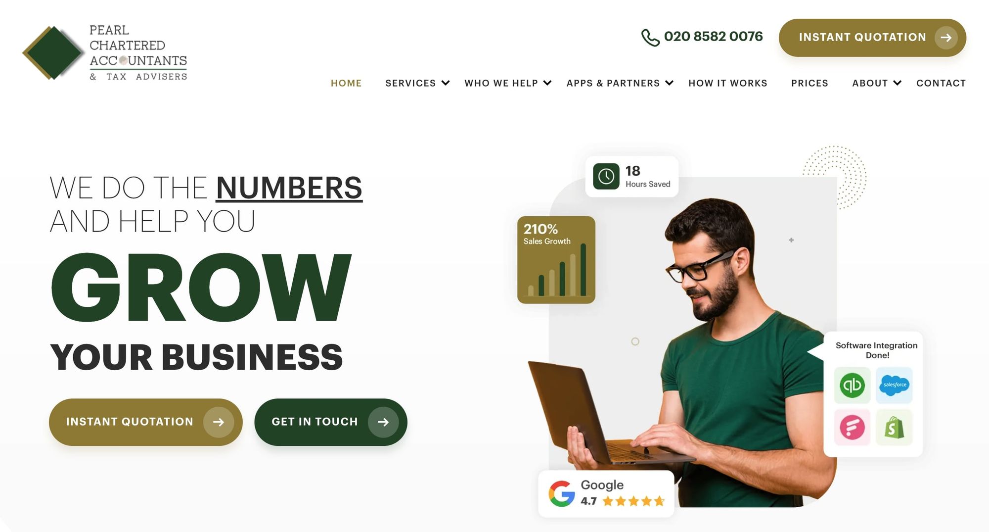
- Website built with: WordPress
Pearl’s site also uses lots of white space to frame its offering and includes a quotation request form as well as a contact form, placed right at the top of its landing page. As well as the breakdown of services, visitors can access a section called “who we help,” which explores how Pearl can assist a range of different clients from freelancers to established businesses.
Also unusual is the dropdown of apps and platforms their accountants can use, which may be helpful to reassure clients that they won’t have to learn a new accountancy platform to interact with Pearl. The “About” section details this UK accountant’s unique way of working. The site is clear, straightforward, and direct.
9. Accountant Partners
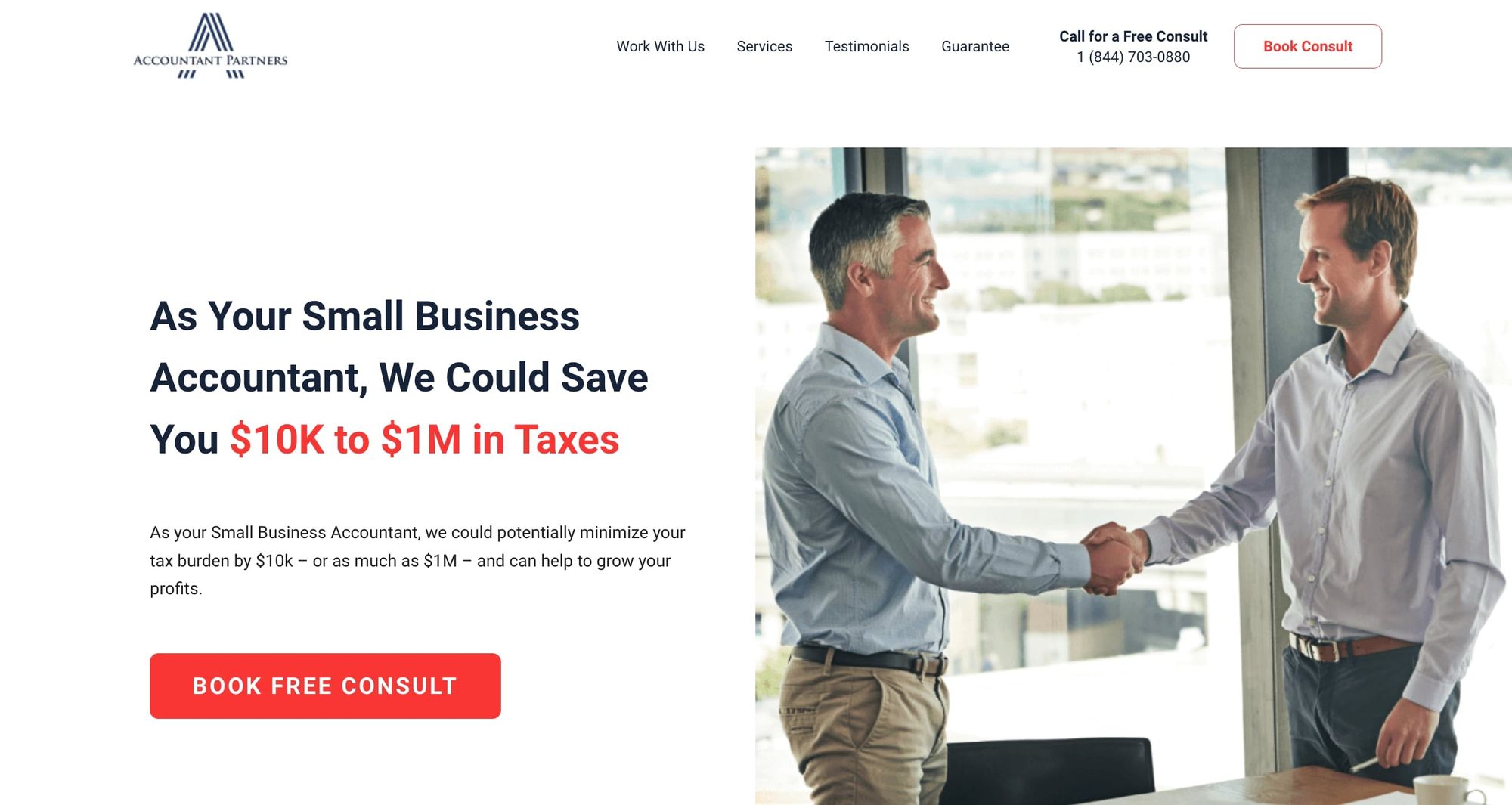
- Website built with: WordPress
Accountant Partners go for the jugular, by opening with a bold claim “We could save you $10K to $1M in Taxes,” paired with white space, and a positive image of a deal being struck. Further down the landing page, there’s a carousel of glowing testimonials, followed by a structured argument for adopting AP over their rivals.
All sections of the site are contained within the same scrollable landing page, with the menu taking the visitor directly to the appropriate slice. The page ends with a “book a consult” link, a more proactive approach to lead capture, and there’s a button linking to this on the top right of the page, meaning it cannot be missed.
10. EC Accounting Solutions
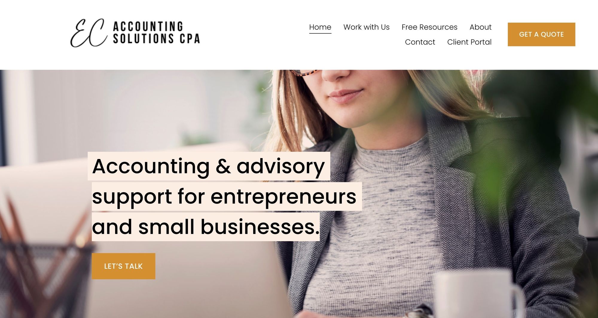
- Website built with: Squarespace
The quote request button is also adopted on Accounting Solutions’ site. There’s a likable biography and photo of this Canadian accountant, Elaine, plus sections on her services. There’s also that all-important client testimonial.
There are two unusual ideas on this site. The first is the section of “Free Resources,” which includes downloadable tips and cheat sheets. The second is a purchasable “sole Prop Biz Kit,” a pre-packaged set of tools for solo entrepreneurs. These are both good ideas borrowed from B2B software companies, who often offer “freemium” tools or guides to win new clients.
For established clients, there’s a client portal link for secure document upload. This is a professional site optimized for new business, and its bright green and yellow color scheme is friendly and non-corporate in feel.
11. KPMG International
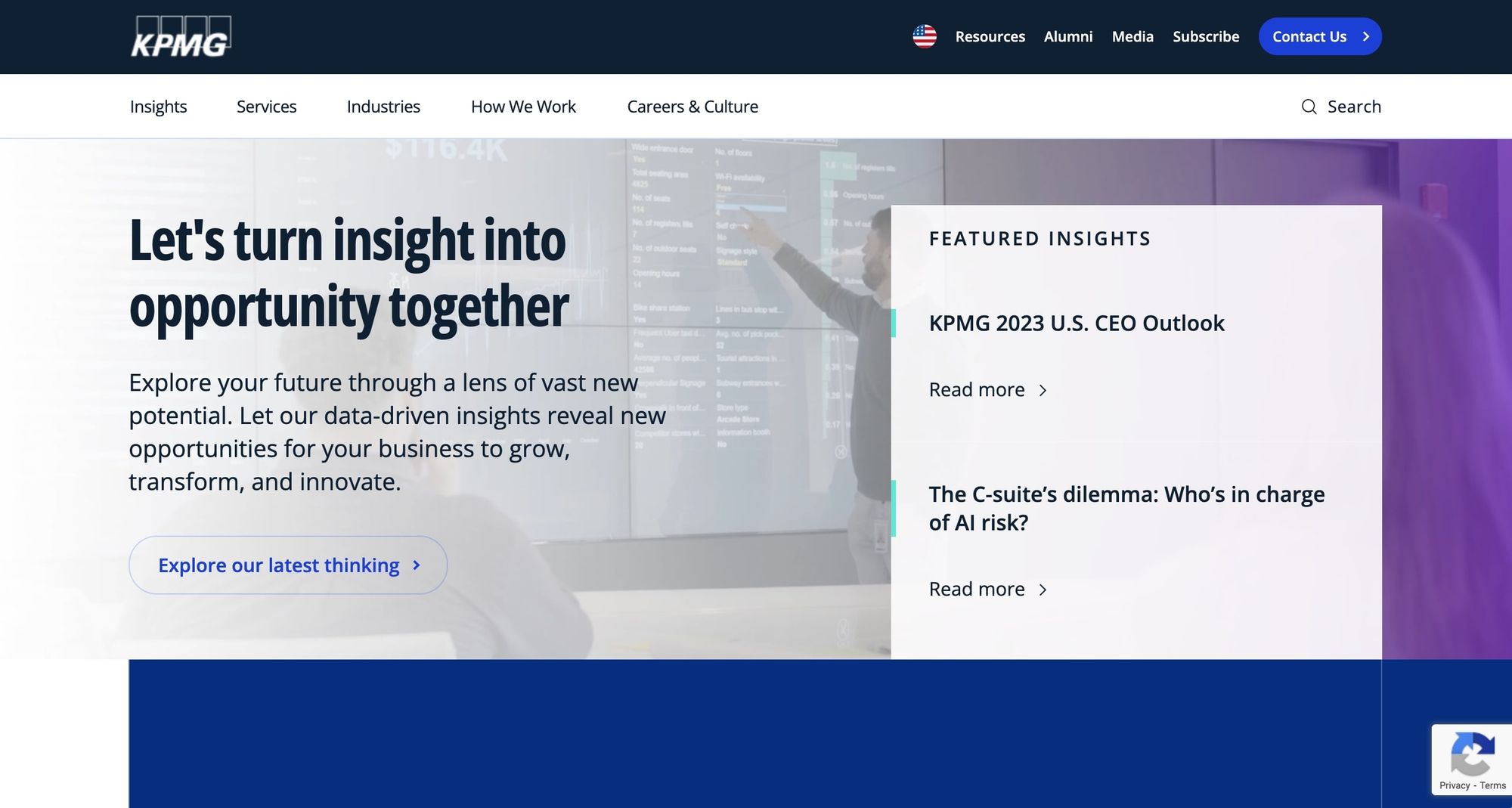
- Website built with: Custom React code
KPMG is one of the world’s best-known accountancy brands. As such, they foreground thought leadership on topics as diverse as ESG, the economy, and the public sector. KPMG produces and circulates reports which enhance its reputation while attracting new corporate clients.
Such a large firm needs to find a way to break down their offering into bite-sized pieces and their global site does this well with sections on different industries and services. KPMG goes beyond testimonials with a host of impressive case studies, and the “about us” section leads with a message from their global chairman and CEO.
The site is immaculate and easy to navigate, with plenty of emphasis on the company’s values and goals.
12. Launch CPA
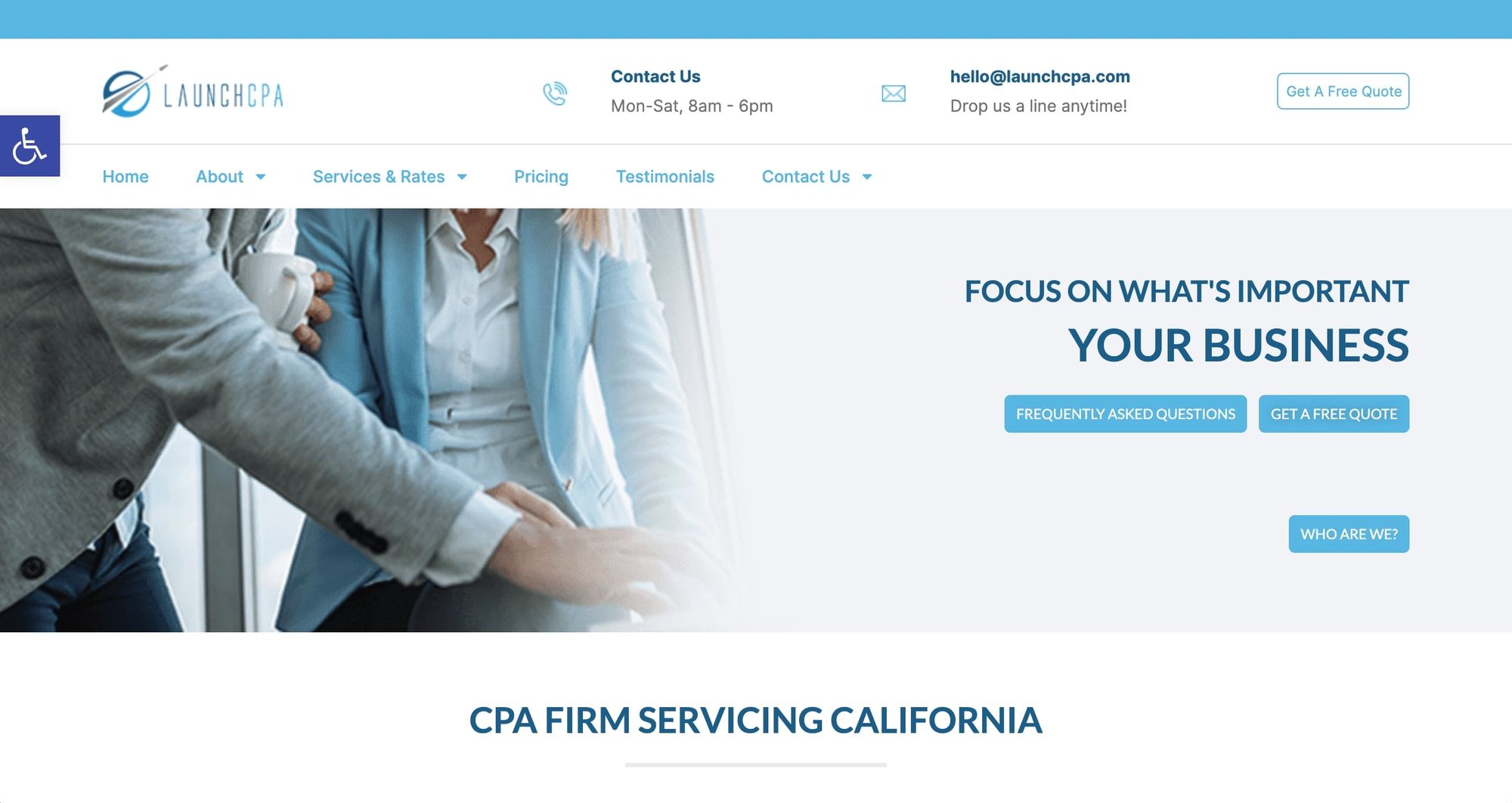
- Website built with: WordPress
Launch CPA’s site is another design promoting white space, with calm blue text. Helpfully, there are accessibility tools for those who may find this subtle approach hard to read. The mid-sized Californian firm has a great sci-fi-inspired logo and a separate testimonials section.
However, the blog contains only one article, and the site overall feels a little anemic and generic. Helpfully, phone and email contact details are provided at the top of the landing page, an often overlooked but helpful inclusion.
13. SingerLewak
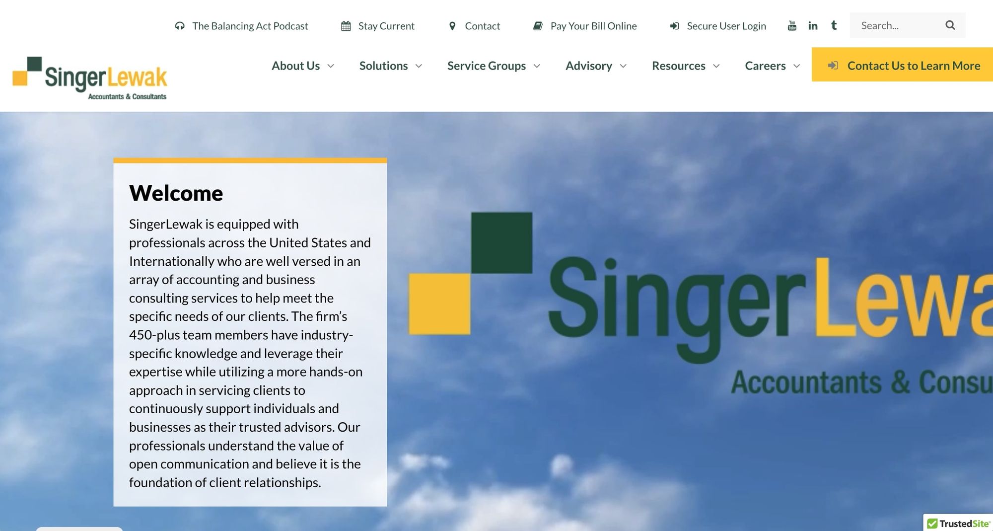
- Website built with: WordPress
Singer Lewak goes bold with color, movement, and video content, taking an accessible approach to thought leadership by embedding YouTube content with well-designed graphics and podcast episodes. The mid-sized firm has a lot of written content under headers that detail affiliated firms and advisory services.
Like many larger sites, the Singer Lewak approach is to break down services and industries separately and include an “about us” section that lays out the company ethos, including awards and charitable work. This helps add a human face to something that could otherwise feel too corporate.
The site has plenty of resources to download or consume, and a thorough careers section, vital for recruitment in this growing firm.
14. Paula Marie Bruce CPA Inc
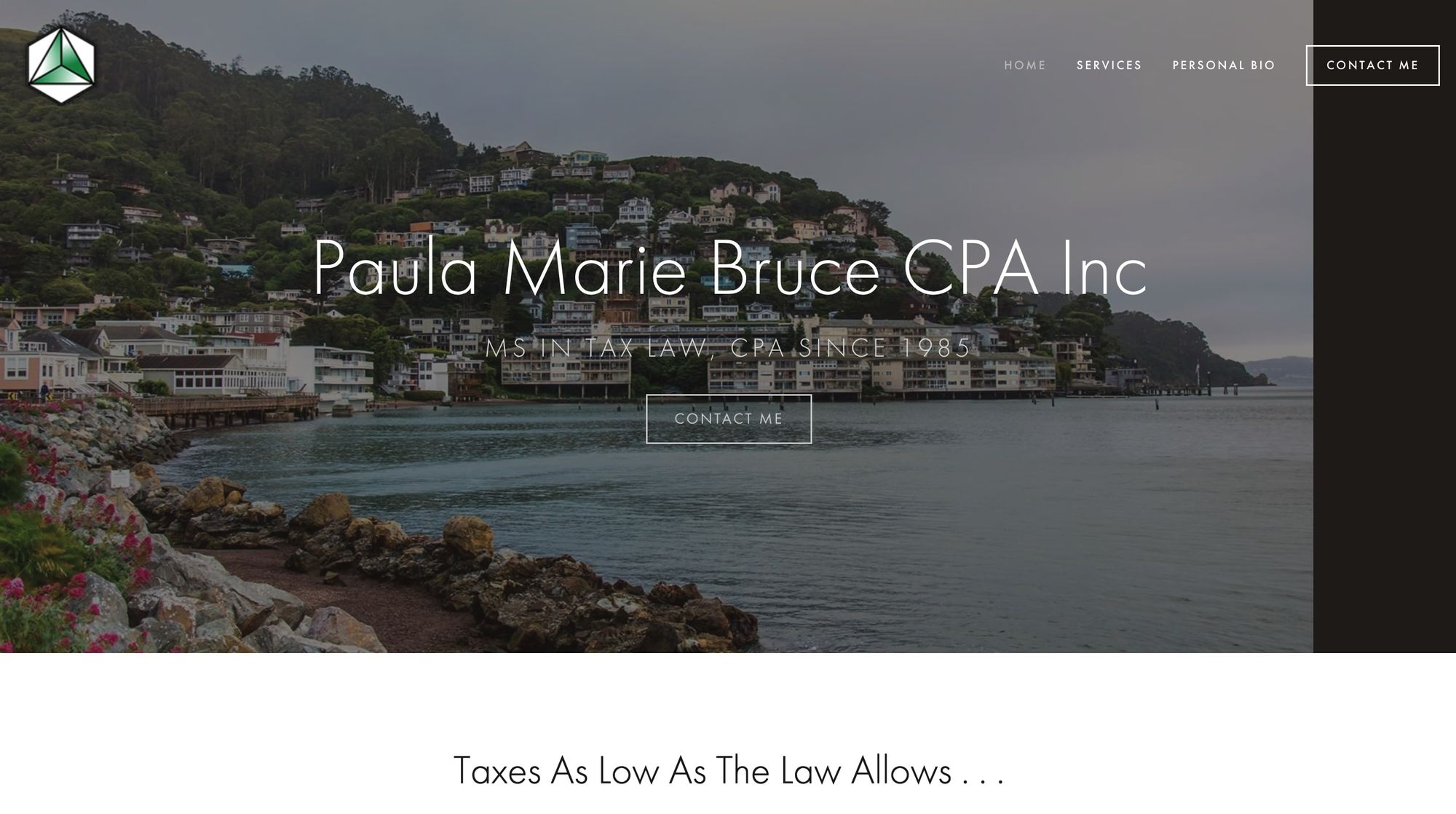
- Website built with: Squarespace
Paula’s website is attractive and minimal with just three sub-sections: “Services”, “About Me” and an appointment scheduler. The site is headed with eye-catching scenic photos, situating Paula in her Californian / Hawaiian locations.
There’s plenty of white space and a personable biography with a clear photo of Paula. The contact form is easy to find, and phone numbers are presented. It’s a straightforward approach that emphasizes personality and approachability.
15. John W. Weldon CPA
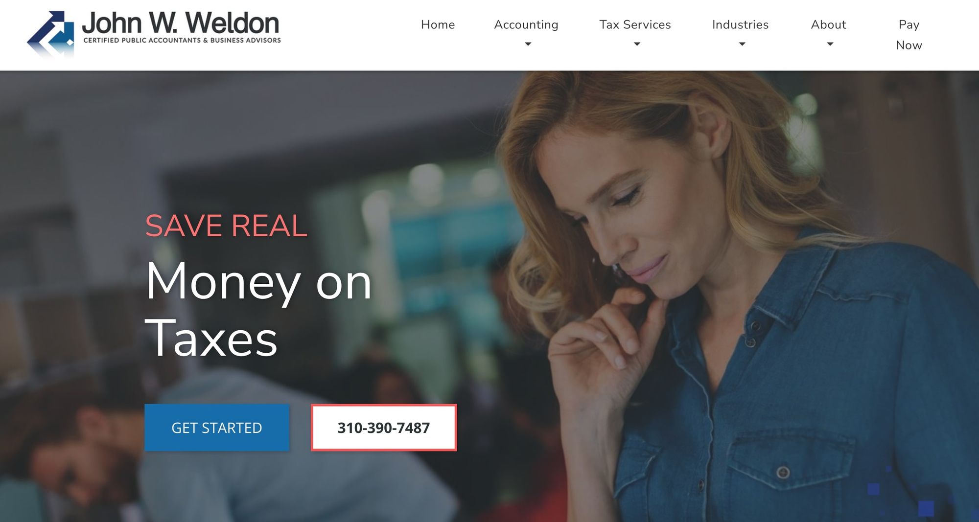
- Website built with: Custom code
Another individual site, Weldon’s landing page uses movement and a very visible contact link to draw in new clients. Accounting and tax services are listed separately on the main menu, positioning this accountant as a tax specialist.
Interestingly, as well as a testimonial section, there’s an invitation to leave a review on Google and Yelp, something not many sites promote. It’s a bold gambit that displays confidence, but perhaps only suits established businesses that have garnered lots of positive testimonials.
There’s also a “pay now” feature to help existing clients settle their invoices, helping maximize revenue.
16. Coastal Tax Advisors
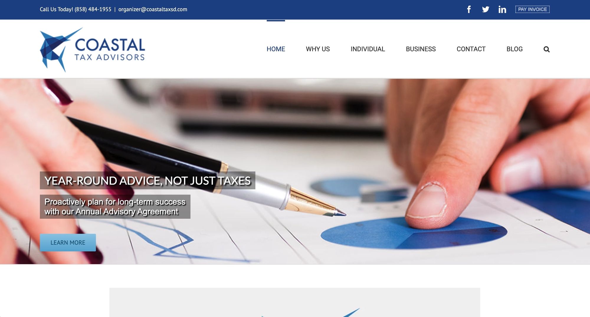
- Website built with: WordPress
Another site with a great logo and visuals is Coastal Tax Advisors. Named after their location in San Diego, this medium-sized firm has a well-laid-out landing page with biography pages for its two principals and other staff, and separate sections for individual and business tax requirements.
There’s also a blog, which is updated with new articles each month (a vital aspect of hosting a blog is contributing to it regularly). Finally, the contact field is as basic as possible, allowing messages to be composed and submitted in mere minutes.
Extra points are gained for putting their phone number and email address at the very top of the page and for the high quality of the photography and design elements on display.
17. Akopyan & Company
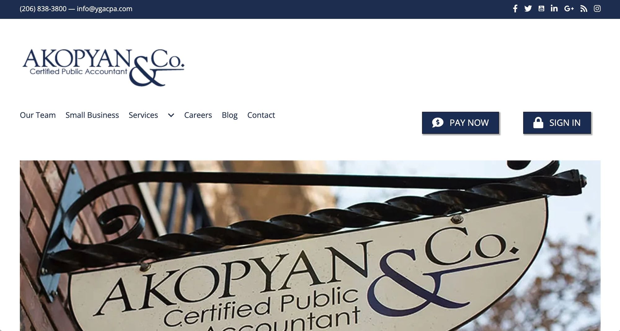
- Website built with: WordPress
Akopyan specializes in small business accountancy and the old-school shop sign they feature as their main image reinforces this ethos. This family-led firm features pocket biographies of its staff and a thorough description of their offering.
Services are individually explored, and there’s a well-written and helpful blog written by the firm’s founder Yuriy Akopyan. This is updated roughly once per week. The site has a client portal sign in page and a link to pay invoices, combining a public-facing landing page with a facility for existing clients.
The design incorporates lots of white space and social media links. But, our only criticism might be the use of a smallish font in grey-on-white, which may be difficult for some visitors to read.
18. Nth Degree CPAs
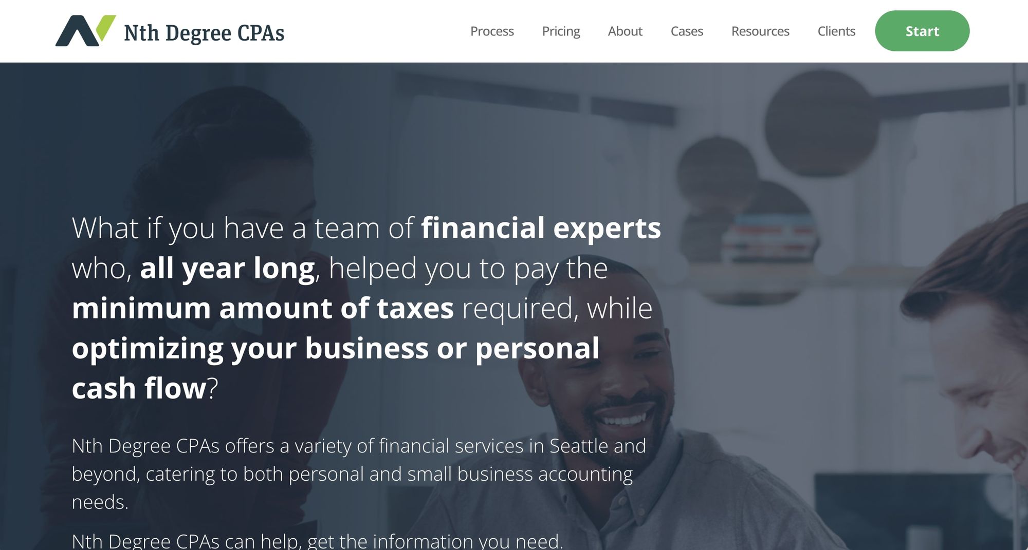
- Website built with: WordPress
A great alternative to using white space is to reverse the color scheme and use white text on a block of dark space. Nth Degree’s website adopts this approach with a semi-opaque image in dark blue with white text on top.
Founder and CEO Dan Nicholson delivers a video introduction, embedded from YouTube, which is a nicely accessible touch. There’s a section outlining Nicholson’s working process, and some helpful, anonymized case studies. The landing page’s “about” section includes photos and bios of key staff, alongside corporate value statements. The monochrome images here continue the landing page’s design and unify the site’s overall look.
An unusual feature here is an online questionnaire in lieu of a traditional contact form, linked with a “Start” button. There are also phone numbers for visitors who prefer a more direct approach.
19. J.A. Rodriguez CPA
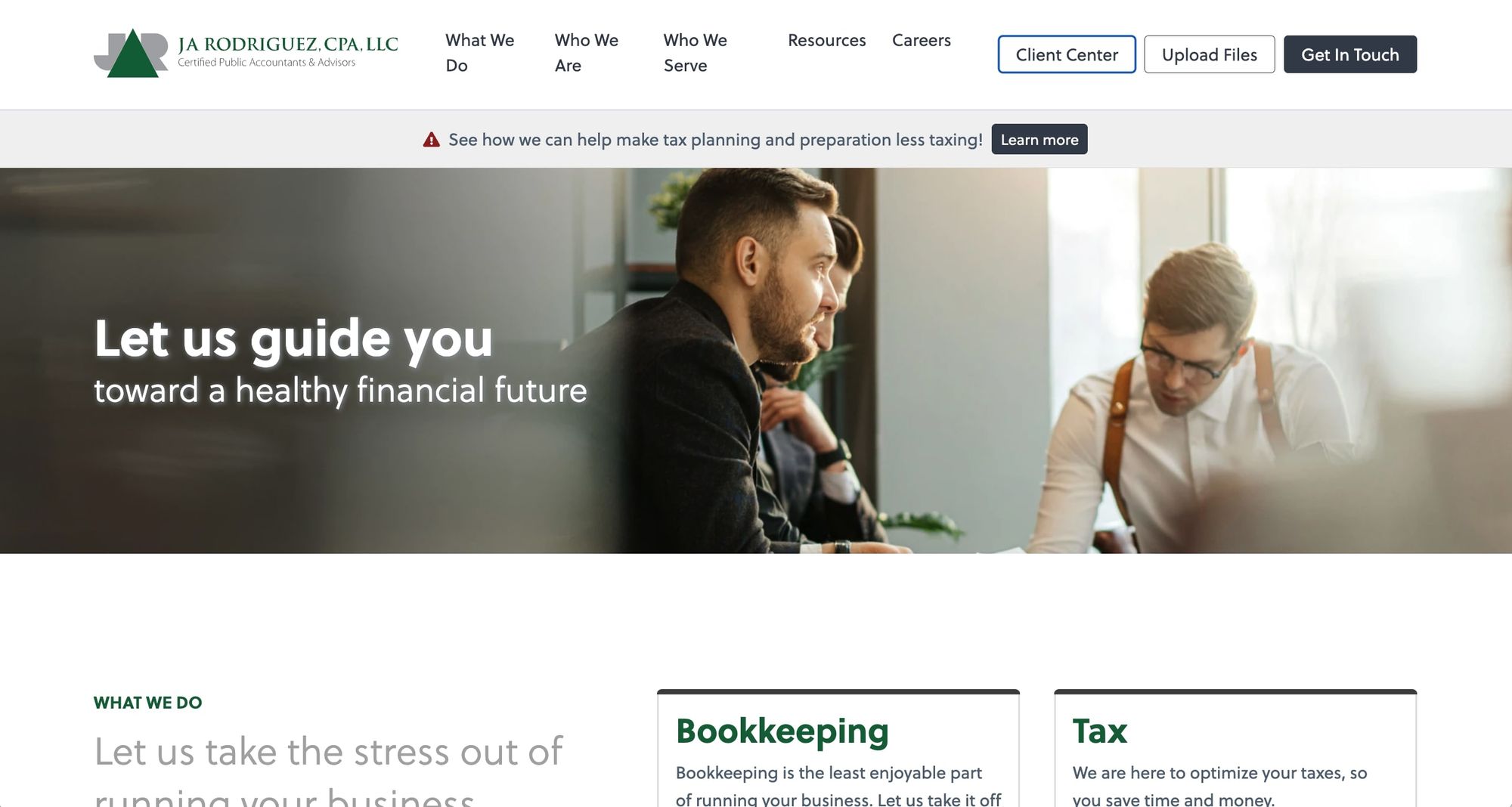
- Website built with: Custom code
This small firm promotes thought leadership, accessed via themed magazine-styled collections of blog posts and articles. This is a novel way to upscale a blog and works very well.
The landing page’s navbar headers are straightforward: “what we do,” who we are,” and “who we serve.” There’s also a lengthy resources section that contains everything from testimonials to downloadable forms and eBooks (great for collecting those all-important leads).
It’s a customer-centric approach that offers real value, while helping to build a mailing list.
20. DHCPA
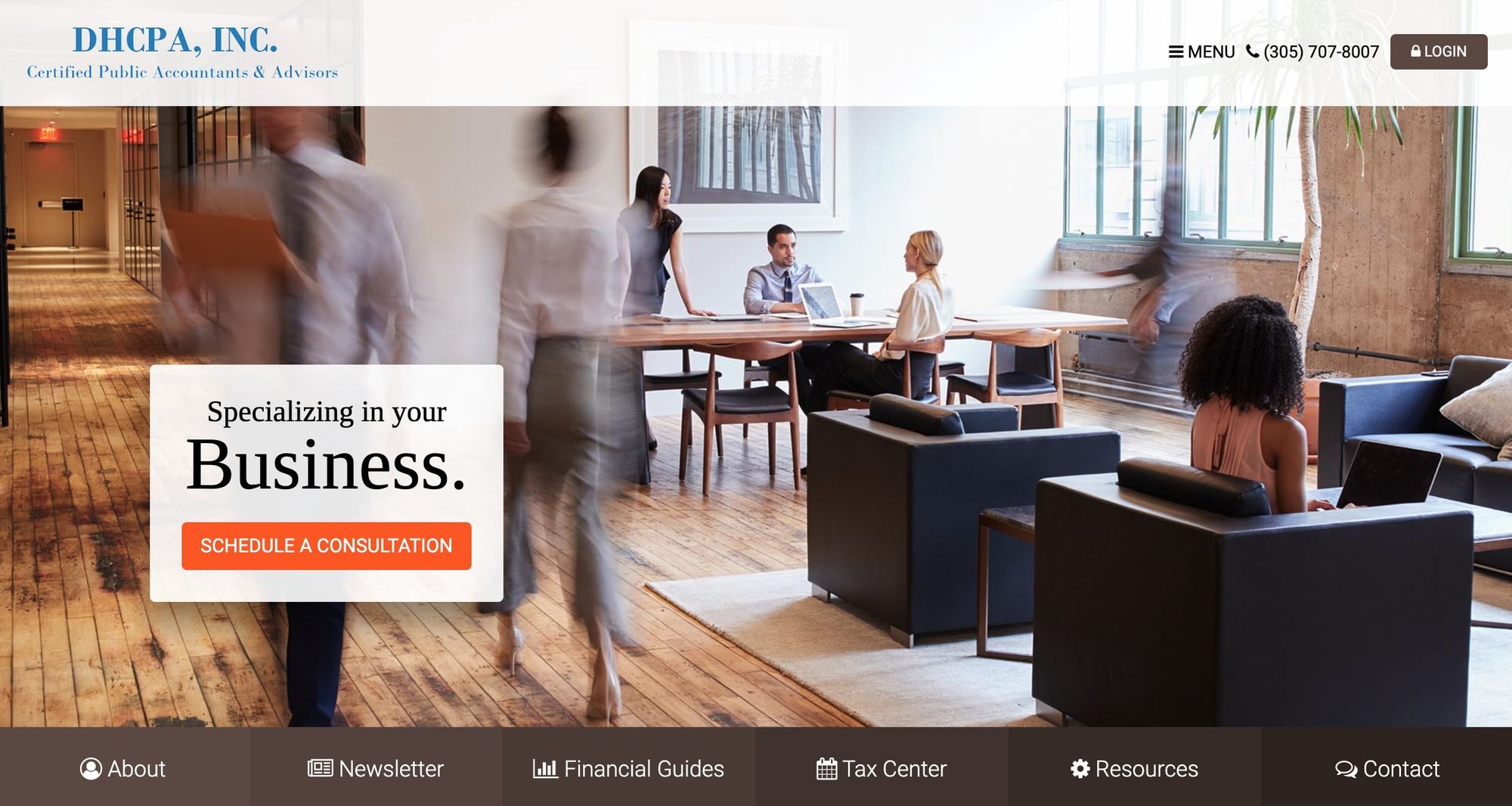
- Website built with: Custom code
This Miami-based company has an attractive landing page with movement, large well-taken photos, and plenty of features without feeling cluttered. The site includes a secure client portal for document sharing, a query form, a separate form to book consultations, and an opt-in newsletter. The page is very much about providing multiple ways for new clients to interact with DHCPA.
Testimonials, social media links, and free downloadable resources are all present and correct, although the blog link contains no content (perhaps it’s a work in progress).
21. Four Brothers Financial
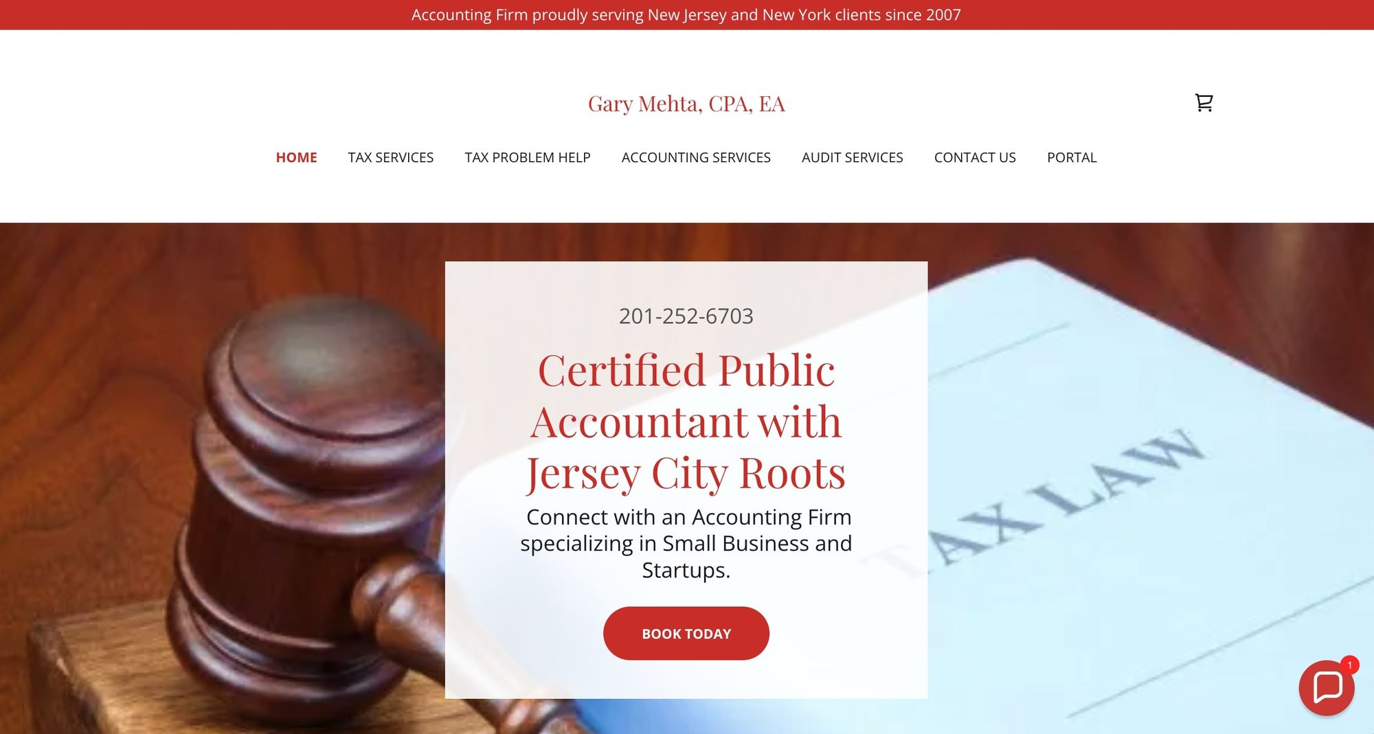
- Website built with: GoDaddy
The Four Brothers Financial site leads with a powerful image — a gavel and a Tax Law document — reminding the visitor how vital it is to obtain good financial representation and support. Mehta positions his firm as a problem-solver, with a special section on tax issue resolution.
The tidily arranged site contains a lot of information for clients who are less financially aware, and there’s a booking system for different kinds of appointments. The landing page is headed with the company logline, and there are addresses and photos of their many satellite offices. All-in-all it’s a helpful and accessible professional site.
Modern accounting firms run on Copilot
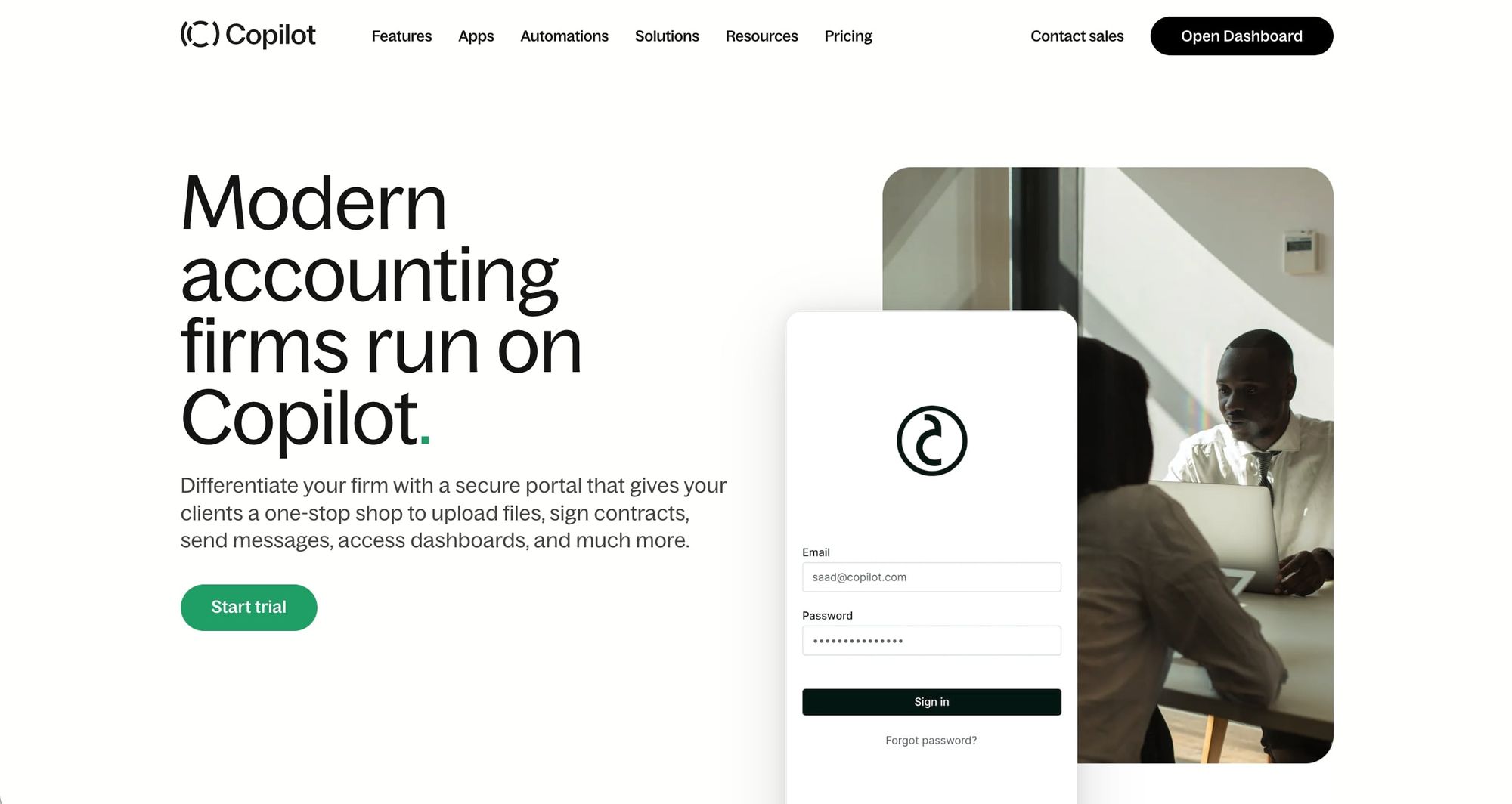
A website is just the first part of your accounting firm's tech stack. While getting the website right is a vital aspect of presenting your public face to the world, optimizing those back-office functions and client relationships is key too. That’s why so many accounting firms choose Copilot as their business management platform.
Providing everything from customer support to workflow automation, billing, and white-label client portals, Copilot helps you deliver professionalism and excellence 24/7. Start your free trial of Copilot today!
Share this post
Sign up for our newsletter
Subscribe to our newsletter to receive emails about important announcements, product updates, and guides relevant to your industry.
